Colour and Black and White
The work of black and white and colour photographs in the museum gallery space is markedly different. Colour is part of what Kratz has described as ‘rhetorical repertoires’ which both generates and communicate both political and aesthetic idioms in the gallery.[i] Colour is used often in very specific instances, to show the immediacy of contemporary experience or the use of an object in living experience. Colour reinforces the realist insistence of photographs. It brings content to the surface of the image, in ways that can be intrusive if the intention is to create mood, but nonetheless useful if intended as visual information.
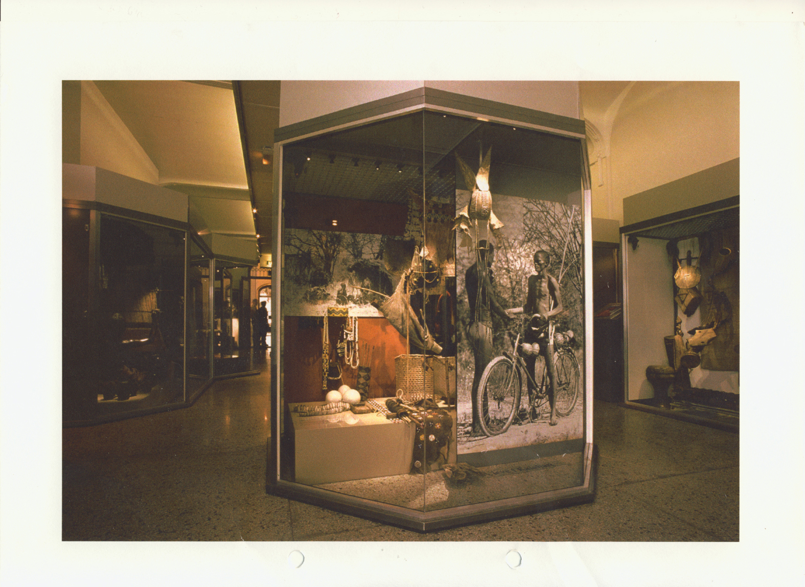
, exhibition The Story of the Netherlands-Indies. IHC, Bronbeek, Arnhem (NL), 2011. Photographer Janita Sassen. © Indisch Herinneringscentrum.")
Colour is use for two forms, as visual strategy, literally to enliven a case visually– often the top of the space is filled with colour photographs as in the Wellcome Gallery of the British Museum, or the Body Arts display at Pitt Rivers Museum. Alternatively the colour photographs give an immediacy to the use and social contexts of objects.
In many instances colour is used as a visual short hand for contemporary – although colour photography has been widespread for half a century, it tends to be read as ‘now’. For instance, the South East Asia galleries of the Tropenmuseum the objects are given ‘atmosphere’ and a sense of pastness by the black and white photomurals, as opposed to the use of coloured photographs in the displays on contemporary Africa upstairs, where, although at the same time a design solution, the colour suggests a modern vibrancy.
While this can be a simple way of dealing with a sense of the temporal, its efficacy is dependent on the choice of image. An example of the Nuer and Dinka case at Pitt Rivers Museum uses two sets of photographs , one black and white, the other colour. Yet because content has been privileged over style and genre, the desired sense of continuity slips into a form of timelessness. The colour is dominated by the style which rather than suggesting the passage of time, reinforces a sense of the timelessness of Nuer and Dinka culture.
Colour is also used to add meaning to the historical. For instance at the Indisch Herinneringscentrum, Bronbeek in the Netherlands, a museum on the Indo-Dutch colonial wars and nationalist movement in Indonesia, black and white photographs in the opening displays are washed into a blood red coloured background to imply the violence of the history being represented.

At a practical level, colour also seen as ‘clashing’ with the design of exhibitions. The use of colour and light in exhibition design make photographs harder to handle. It is significant that photo-murals, unless of vegetation or landscape, are seldom in colour. This is not merely a question of cost, but design. Colour is seen as drawing attention away from the objects, a concern expressed at Olso Cultural History Museum. Consequently black and white photographs, including colour photographs rendered as black and white, are used to perpetuate hierarchies of objects and narratives in museums, where it is assumed that the role of photographs is to support but not overshadow other classes of object. The use of colour is therefore often confined to monitor and interactive features accompanying exhibitions and objects rather then in the gallery itself, marking a subtle shift in the work of photographs in the museum. There are exceptions. For instance, the ‘body arts’ display in the lower gallery at Pitt Rivers Museum, uses a range of colour photographs to demonstrate and contextualise objects, but at the same time, the colour is used to thicken the sense of a multiplicity of bright and attractive objects which fill the cases.
")
Some museums use sepia toning of photographs to signify “past’ and create ‘the look’ of the past. Sepia, the brown/yellow tones of the quintessential ‘old photograph’, here signifies the security, solidity and romantic nostalgia for the past, as colouration of ‘sepia’ becomes a material signifier of historical depth and authenticity, setting up specific values of ‘the historical’ in the gallery. This creates tensions in the use of photographs of the colonial past. It can too readily signify the kind of nostalgia for the colonial past which all the curators we talked to, without exception, were anxious to avoid. On the one hand, in a device also used in Gallery 36 at Birmingham and in the Dutch Colonialism Gallery at the Tropenmuseum, the British Empire and Commonwealth Museum demonstrated used a wide range of sepia and black and white tones which reflected the material qualities of the original photographs. Consequently the different tonal qualities work towards an enhanced the sense of historical specificity of the photographs, adding to the complexity of their narrative in the galleries. On the other hand, in the Wellcome Gallery, London, the ‘ethnographic photographs’ are both enhanced aesthetically and endowed with a sense of an undifferentiated past through their sepia toning. The uniformity of the sepia toning here does not allow for the historical specifics of the photograph or their different moments and technologies of production. Despite the act that the photographs were originally made over a 60 – 70 year period, they set up a sense of an undifferentiated ‘pastness’ of what James Clifford writing of salvage ethnography has called the timeless “the ethnographic pastoral.”[ii]